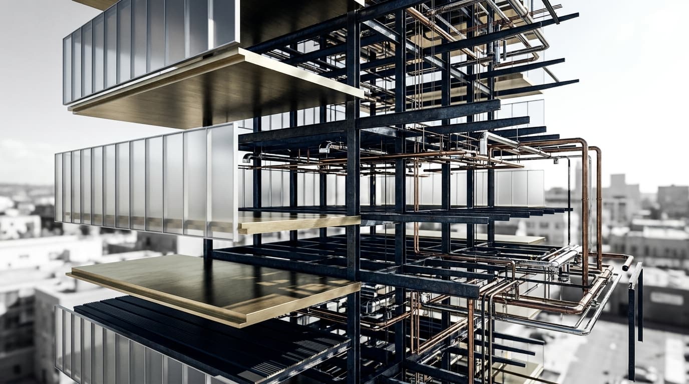
Six A1s pinned along a corridor. The panel arrives, coffee in hand, and stops about two and a half metres back — far enough to see all six at once, too far to read anything smaller than a title. Nobody has spoken yet. In the silence, one of them tips their head at the third board and says "so is this the one?" and now you are answering a question about circulation before you have said a word about what the building is.
That moment is the whole problem. Your board gets read before you get to explain it, and it gets read at a distance, in bad light, by people who have four more projects to see before lunch. The drawings aren't the issue. The order in which the eye hits them is.
Almost every student lays out a board the way the project happened. Site analysis, because that came first. Then concept sketches. Then the massing studies, the plans, the sections, and finally — bottom right, squeezed — the render that took three days.
That's a chronology. Nobody reads a chronology. What a viewer actually does is scan for the biggest, highest-contrast thing on the sheet, decide from that what the project is, and then hunt for evidence that confirms or contradicts the guess. If the biggest, highest-contrast thing on your board is a coloured sun-path diagram, congratulations: your project is now about sunlight, and you will spend the crit dragging the panel back from a conversation you never wanted to have.
So stop laying out the process. Lay out the eye path.
The first-glance zone is the entire pitch
Give the top-left region of your first board to two things and nothing else: one hero image, and one line of text that says what the project is.
The hero image is whichever single drawing carries the argument. Usually that's a render or a sectional perspective, but not always — if your scheme is fundamentally about a plan move, the plan is the hero and you should be brave enough to blow it up. The test is simple: if the panel saw only this image and read only that one line, would they have the project right? Not fully, not in detail. Right.
The one-liner is harder than the image. It is not a title, not a poetic fragment, not "Threshold: negotiating the liminal." It is a sentence a stranger could repeat back. "A timber-framed market hall that lets the existing viaduct arches stay open to the street." Twelve to twenty words, set large enough to read from where the panel is standing. We teach this as the first question of the whole exercise — before layout, before software — because it's the thing every other decision on the board gets measured against.
Everything else on that first board is now a supporting act. Including your site analysis.
Demote the analysis. It will survive.
Site analysis diagrams are where boards go to die. They are numerous, they are colourful, they are individually quite satisfying, and they are almost never the reason anyone likes your project. Six equally-sized circles with arrows on them will out-shout a beautiful section every single time, because six of anything beats one of anything in a quick scan.
Run them as a strip. One horizontal band across the bottom or down one edge, all the same size, all the same graphic language, each with a three-word caption. Small. Quiet. They read as a set, which is exactly what they are — evidence you did the work, not the argument itself. A strip of eight small diagrams takes up less visual weight than two medium ones, which is the opposite of what people expect, and it's the fastest fix available to most students.
The same goes for precedent studies, iteration sketches, and anything else that documents process rather than proposes something.
Three levels. There is no fourth.
Here is the structure we teach, and it is deliberately brutal:
Primary — one element per board. The hero. It should be unmistakably the largest and highest-contrast thing on the sheet. Not slightly larger. Obviously larger, by a factor you'd notice from across a room.
Secondary — three to five elements. The key plan, the long section, maybe one more render. These are readable at conversational distance, consistent with each other in style and weight, and they sit in a clear relationship to the hero.
The primary tools for enforcing that are the boring ones: size, contrast, position and colour. Size does most of the work. Contrast does the rest — a single full-bleed dark image on a white sheet will pull the eye harder than anything else you can do, which is also why you only get one.
What breaks hierarchy, nine times out of ten, is a fourth level creeping in. A drawing that is neither big nor small. A caption set almost as large as a subheading. A diagram that's mid-grey when everything else is black or light. Ambiguity at any level collapses the whole thing, because the eye stops knowing what to skip.
Equal size is a decision not to decide
The habit is understandable. You worked equally hard on all of them, the InDesign grid divides neatly into six, and shrinking your own section feels like admitting it isn't good.
But a board where everything is the same size tells the viewer that you have no view about what matters. And the panel will form their own — from whatever happens to be loudest, or most colourful, or nearest the top. You've handed away the one piece of control you actually have.
Being selective is the skill. Fewer, well-chosen, well-integrated drawings beat a complete inventory every time, and the discipline of cutting is where most of the improvement in a board comes from. If a drawing doesn't advance the story, it isn't neutral — it's competing with the ones that do.
Four tests, none of which need feedback from another human
The squint test. Squint at your board until it goes soft. What's left should be one dominant dark mass (the hero), a legible title, and a rhythm of lighter blocks. If you see an even grey field, you have no hierarchy. If you see three competing dark masses, you have three heroes, which is none.
The thumbnail test. Export it, shrink it to roughly the size of a playing card on screen, and look. Same question. This is also how your board will be seen if it ends up on a projector at the back of a room, or in a PDF someone scrolls through on a laptop.
The across-the-room test. Print at full size if you possibly can, pin it at eye level, walk back three or four metres, and read what you can read. Whatever's illegible at that distance is either tertiary information (fine) or a mistake (not fine). A test print also catches the thing screens never show you: how much darker a dark render prints, and how the greys in your line work close up on each other.
Upside down. Rotate the whole layout 180 degrees and look at it as pure composition. Because you can no longer read it, you can finally see the balance — the clumps, the lonely corner, the gutter that's slightly wrong.
Do these in that order and you will find more problems in ten minutes than three friends will find in an hour of being polite about it.
White space has to pay rent
"Add more white space" is the most repeated and least useful piece of layout advice going, because it gets taken as "spread things out evenly," and evenly-spread white space just makes a weak board bigger.
Here's the rule we use: white space earns its keep when it does one of two jobs — separating a group from another group, or isolating the hero. Space that isn't doing either of those is just a gap, and gaps make a board feel unfinished.
Which means the spacing on your board should be dramatically uneven. Drawings that belong together sit close — tight enough that they read as one block. The gap between blocks is noticeably bigger than the gap within them. And the margin around the hero is bigger than anything else on the sheet, because that generosity is what tells the eye where to start. If your gutters are all the same value because the grid made them that way, you have a spreadsheet, not a composition.
Outer margins: keep them consistent across every board in the set, and keep them wider than you think, because A1s get pinned with bulldog clips that eat forty millimetres of the top edge.
Write it for a panel who read it without you
Plenty of boards are read when the student isn't standing there — hung the night before, reviewed over a weekend, judged for an award. Assume that's the case even when it isn't.
That means minimal annotation, placed directly on the drawings rather than in a paragraph somewhere else. Two or three words per note. Name spaces on the plan. Name materials on the section. Never write a body of text that explains what the drawing shows, because nobody reads it and it makes the board look cluttered from two metres.
And give the panel the navigation aids they are trained to look for: the same north point, in the same corner, on every plan. A scale bar on everything measurable. Levels named the same way on plans and sections so they can cross-reference in one glance instead of three. These are unglamorous and they are the difference between a jury following your section cut and a jury quietly giving up on it.
The night-before triage
When it's one in the morning and the board isn't finished, cut in this order — and cut whole items, never quality.
Keep the hero image, finished properly. Keep one plan that explains the scheme. Keep one section that explains the bit a plan can't. Keep the one-line concept statement, set large. That's a board that works.
Go next for: the remaining renders, if you have more than two. Then the iteration sketches. Then half the site analysis — a strip of four is as convincing as a strip of nine. Then the exploded axo, which takes four hours and says less than a good section.
What you protect at all costs is the resolution and cleanliness of the primary element. A half-rendered hero drags the whole set down; a missing diagram nobody notices.
If the project runs across several boards, front-load it. The first board should be able to stand alone and win the argument. The ones after it are for the panel who has already decided they're interested — that's where the technical depth, the details and the full drawing set live. A jury that spends thirty seconds and moves on should still leave with your scheme in their head.
Get that first thirty seconds right and the rest of the crit is a conversation about your project instead of a search party for it.