Black Friday•30% off annual plans•Win an iPad + Apple Pencil•Ends in --d --:--:--•Black Friday•30% off annual plans•Win an iPad + Apple Pencil•Ends in --d --:--:--•Black Friday•30% off annual plans•Win an iPad + Apple Pencil•Ends in --d --:--:--•Black Friday•30% off annual plans•Win an iPad + Apple Pencil•Ends in --d --:--:--•Black Friday•30% off annual plans•Win an iPad + Apple Pencil•Ends in --d --:--:--•Black Friday•30% off annual plans•Win an iPad + Apple Pencil•Ends in --d --:--:--•Black Friday•30% off annual plans•Win an iPad + Apple Pencil•Ends in --d --:--:--•Black Friday•30% off annual plans•Win an iPad + Apple Pencil•Ends in --d --:--:--•
Black Friday•30% off annual plans•Win an iPad + Apple Pencil•Ends in --d --:--:--•Black Friday•30% off annual plans•Win an iPad + Apple Pencil•Ends in --d --:--:--•Black Friday•30% off annual plans•Win an iPad + Apple Pencil•Ends in --d --:--:--•Black Friday•30% off annual plans•Win an iPad + Apple Pencil•Ends in --d --:--:--•Black Friday•30% off annual plans•Win an iPad + Apple Pencil•Ends in --d --:--:--•Black Friday•30% off annual plans•Win an iPad + Apple Pencil•Ends in --d --:--:--•Black Friday•30% off annual plans•Win an iPad + Apple Pencil•Ends in --d --:--:--•Black Friday•30% off annual plans•Win an iPad + Apple Pencil•Ends in --d --:--:--•
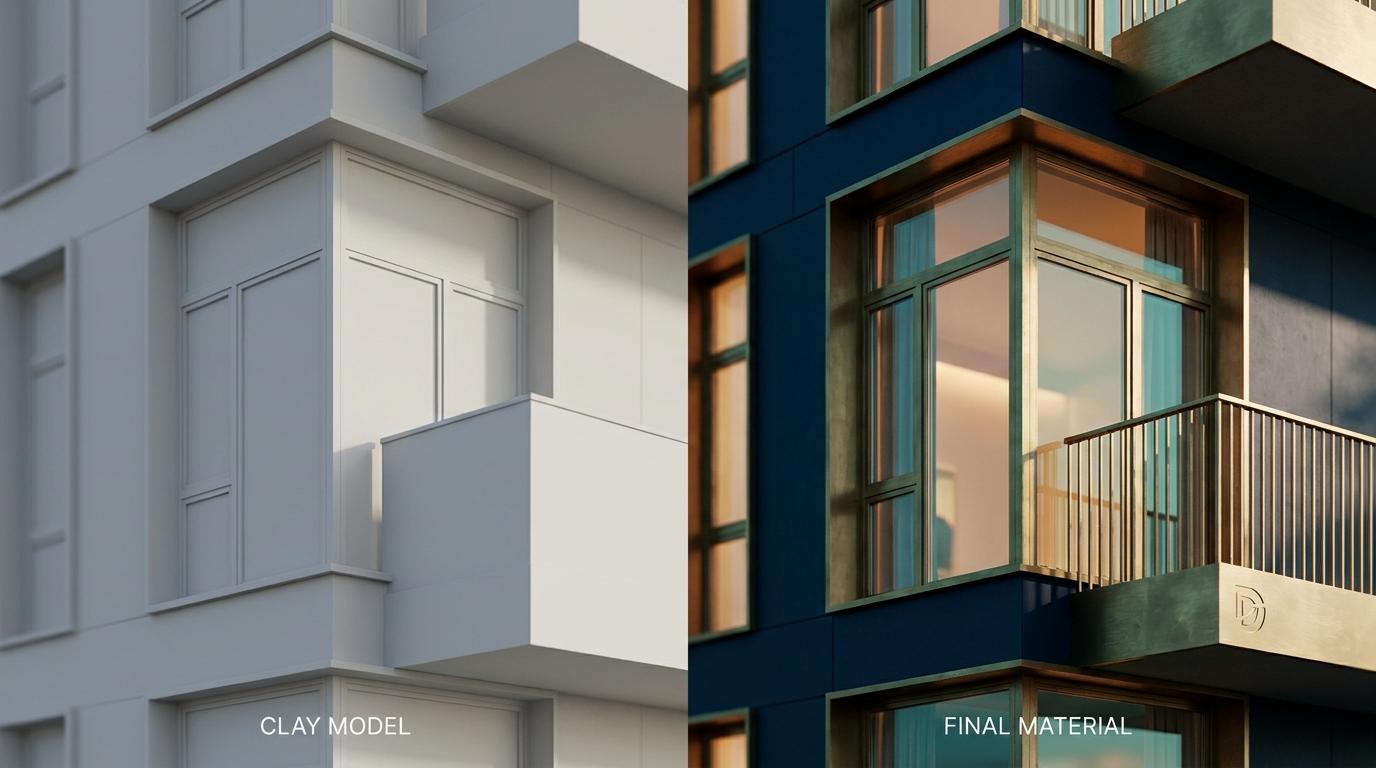
Model's in. Sun's on. And the thing staring back at you looks like a cereal-box version of your building — chalky walls with no surface to them, glass like a sheet of perspex, grass the colour of a snooker table, and a sky doing nothing except making everything underneath it look grey.
That is not a quality-settings problem. Turning the renderer up to Ultra will give you the same image, slower and sharper. Washed out and plastic are two separate faults with two separate causes: auto exposure averaging your frame into mush, and every surface in the scene sharing one roughness value. Fix those two and your first still is already most of the way there.
Here is the whole run, in the order that works, finishing with the same scene reused for a short camera move.
Budget the session before you start, because the failure mode of a first render isn't bad settings — it's spending ninety minutes dragging trees around and then rendering something badly composed at 4K. As a rule of thumb, this is how we'd carve up a first sitting:
Import and prove the scale: ten minutes.
Rough camera, just something to judge everything else against: five minutes.
Sun, sky and exposure: fifteen minutes.
Materials: twenty-five minutes, and that's the bit worth protecting.
Compose the camera properly: fifteen minutes.
Render and export: however long the machine takes, which is not your time.
One rule holds the whole thing together. Do not touch render quality until the composition is locked. Every minute spent judging a scene at render quality is a minute you aren't working.
Prove the Scale Before You Believe Anything Else
Bring the model in through D5's converter plugin for your host app rather than exporting a file and importing it blind. The plugin gives you a live-sync route back, which matters at eleven o'clock when you discover a wall facing the wrong way.
Then do the one check nobody does. Drop a person from the asset library next to the front door and look at them. A door head sits around 2.1m, a domestic storey around 3m — if your figure's head is at mid-door or the handrail is at their chest, the scene came in at the wrong unit and nothing downstream will read right. Depth of field will behave oddly, grass will be the wrong size, shadows will fall at lengths your eye quietly rejects without being able to say why.
The three imports that derail a session, and what they look like:
Scale mismatch. Rhino files authored in metres landing in a millimetre template, or the reverse. Revit coming in via feet. Check the unit in the host file before you sync, not after.
Flipped normals. Faces that vanish as you orbit, or go dead black no matter what material you assign. Fix it in the host model and resync — fighting it in D5 is a losing game.
Lost materials. SketchUp components with materials applied at group level rather than face level, Rhino objects coloured by layer rather than by object. The geometry arrives, the material assignment doesn't, and you end up with one grey mass you can't select apart. Worth ten minutes in the host model assigning sensible material names, because those names become your selection handles in D5 forever after.
Washed Out Is an Exposure Problem
Auto exposure is a democracy, and your render is not a democracy. It looks at the whole frame — bright sky, bright render finish, dark ground — averages it, and pushes the image until the middle grey sits where the algorithm thinks it should. With a white or light-concrete building against open sky, that means the sky blows out, the facade turns the colour of dishwater, and the shadows lift until there's nothing left to anchor the image.
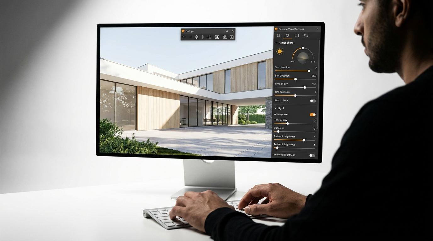
Go manual in the Camera panel. Expose for the building, not the frame. Let the sky run a touch hot if it has to — real architectural photographs do exactly this — then pull it back with the highlight slider rather than dropping the overall exposure. Lift contrast modestly, drop the shadow slider rather than raising it. The instinct to brighten shadows is the single most common way a decent render gets killed, because a render with no black in it reads as fake on sight.
White balance is the free win. The default neutral setting is clinical in a way daylight never is. Nudge it warm by a small amount and the whole image stops looking like a product shot. Don't reach for saturation to fix flatness — saturation is what you add when the lighting has already failed.
Plastic Is a Roughness Problem
Three fixes cover nearly all of it.
One roughness value across a whole surface is injection moulding. Real concrete is rougher where rain runs and smoother where hands touch it; real render has variation at a scale you can see from ten metres. A flat colour with a single roughness number cannot do that, and no amount of path tracing will invent it. Use a library material with a proper map set — roughness, normal, the lot — rather than a solid colour, and if you've got a bespoke finish, load a roughness map even if it's a grubby greyscale noise. The eye is reading surface variation, not colour accuracy.
Glass is too clean and reflecting nothing. Default glass comes out with high reflectance and zero roughness, which gives you a mirror in a scene with nothing worth mirroring. Add a trace of roughness and then give it something to reflect — a tree, a neighbouring wall, a sky with actual cloud in it. And look behind the glass: a black void reads as a hole in the building. Even a floor plane and a hint of interior light changes the facade completely. In the Twinmotion course we use area lights outside windows for precisely this, as a photographer would, to put secondary highlights where the renderer can't be bothered to bounce them.
Your texture scale is wrong and you haven't noticed. A concrete board texture tiled at a metre when the real board is 1.8m makes a building look like a model of itself. Check tiling against something you know the size of — a door, a brick, your scale figure.
One more, which sits underneath all three: every edge in your model is a perfect arris, and nothing in the world is. Where you can, bevel or displace the big ones. Light catching an edge is half of what makes a render feel photographed.
If you want these failure modes laid out with the lighting causes separated from the material ones, we've done that for Enscape in five causes of flat renders — the engine differs, the diagnosis doesn't.
Put the Sun Where the Site Puts It
The environment panel will take a real location and a real date and time. Use them. Not because a planning officer will check, but because the sun at 11am in June over a south-facing elevation gives you a flat, top-lit, structureless facade, and the sun at four in the afternoon in October gives you raking light down the same wall that reveals every board mark.
If the orientation in your host model was never set correctly, the whole sun study is fiction — worth confirming before you spend twenty minutes nudging time of day.
Then cloud. A completely clear procedural sky is a single giant softbox and it flattens everything. Broken cloud gives the sky luminance variation, which gives the facade modelling, which is what you're after. A little atmospheric haze pushes the background back and separates the building from it — restraint here, because haze is the render equivalent of a vignette and just as easy to overdo.
One Camera, Composed Like a Photograph
Stand where a person would stand. Eye height around 1.5 to 1.6m, lens somewhere in the moderate wide range rather than the fisheye the default often gives you, and verticals locked so the building isn't keystoning backwards like an estate agent's photo.
Don't centre the building. Put something in the foreground — a wall, a branch, a planted edge — because foreground is what gives an image depth that no amount of global illumination will. Then save the camera as a view before you touch anything else, so every later change gets judged from the same spot. Changing the material and the camera at the same time is how you spend an hour going round in circles.
Same Scene, Twenty Seconds of Movement
The still is done. The scene is paid for. Now get a second deliverable out of it for ten more minutes of work.
Set two or three keyframes in the video editor — your hero camera, and a position maybe fifteen metres back and slightly to one side. Two keyframes, twenty seconds, slow. Not a flythrough, not a drone orbit. A slow dolly reads as confident; fast movement reads as a video game and shows every shortcut you took in the geometry.
Moving images change the sampling maths. A still can afford a heavy denoise because you only look at one frame; across a sequence, aggressive denoising at low sample counts gives you that faint crawling blotch in the shadows. What we teach in the Twinmotion course applies equally here: the denoiser does less damage when the samples are high enough that it has less work to do, and the detail it eats first is exactly the thing you spent the session creating — fine shadow in foliage and texture on a wall. Raise samples, ease off the denoise, go and make a coffee.
If you want this whole arc taught properly end to end on a real building — materials, lighting, scatter, path tracer settings, stills, video and 360 tours, on Tadao Ando's Koshino House — that's the Twinmotion for Beginners course. Different software, same spine, and the habits transfer in both directions.
Grade It Twice, Not Once
Do contrast, white balance and highlight recovery in D5, where they're part of the camera. Export, then do the rest outside — dodging the facade, a sky swap if yours didn't land, the small bit of dirt that makes the ground plane believable.
And export a clean version alongside your graded one. The graded image is for tonight; the clean one is for the day the client asks for it bigger, lighter, and with a different sky.
The order is the lesson here, more than any individual slider. Scale, camera, sun, exposure, materials, then quality. Get those in sequence and a presentable exterior is an evening's work. Get them out of order and it's a weekend, and it still looks like plastic.