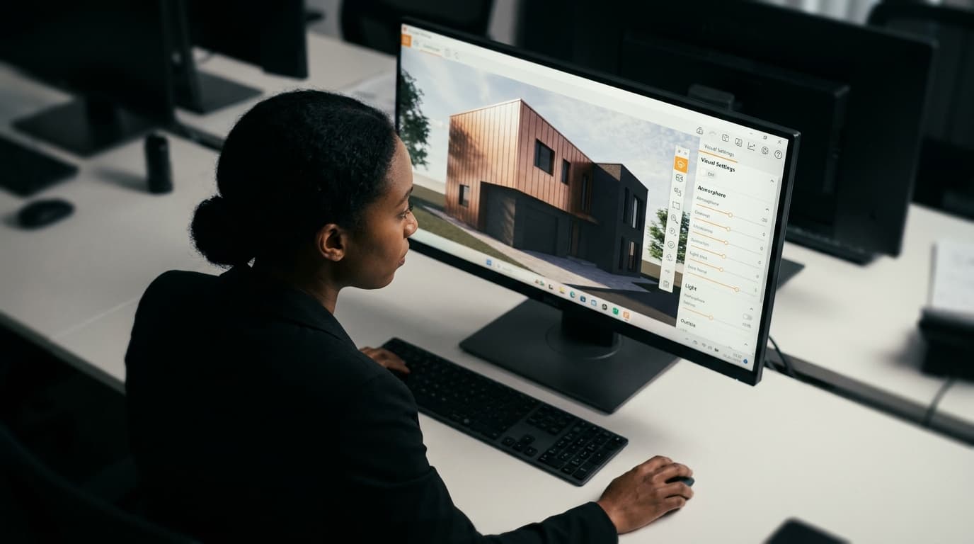
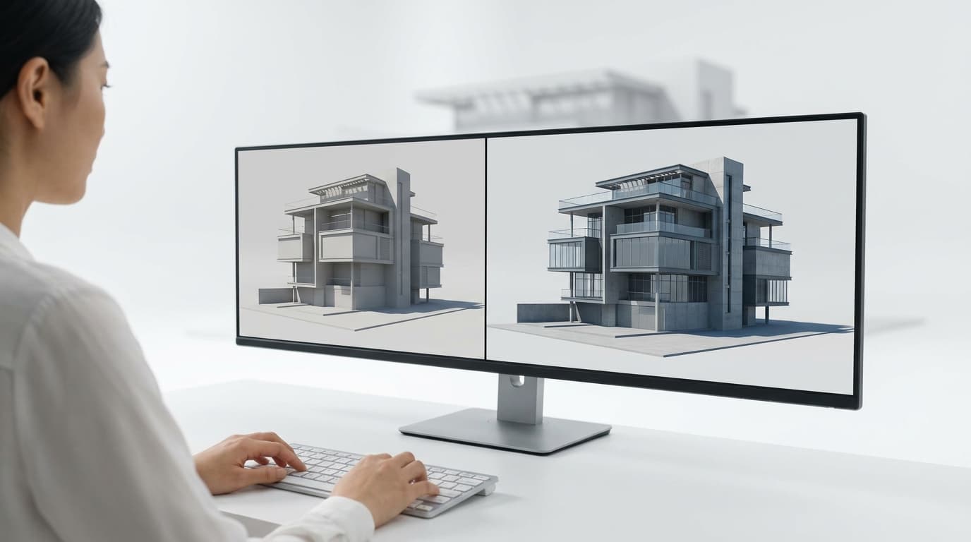
Put the two images side by side on the same screen. Yours, and the one from the practice whose work you keep saving to a folder. Don't look at the building. Look at the darkest patch in each image, then the brightest, then how many different greys sit between them. That's where the gap is. Your render almost certainly has a narrower range of tones, spread more evenly across the frame, with nothing in the foreground to tell your eye how far away anything is.
That's what "flat" means, technically. Not bad geometry, not bad taste. Insufficient variation — in light, in surface, in depth.
And it is fixable inside Enscape. The engine is real-time, which means it approximates bounced light and reflections rather than solving them the way V-Ray does, and that approximation is the reason you can spin a camera at sixty frames a second. But the approximation is not what's ruining your image. Five specific defaults are, and four of them cost you under two minutes each.
Here they are in the order that buys the most image per minute spent.
1. Your sun is directly overhead and your sky is a painted ceiling
Enscape's default sky is a procedural gradient with a sun somewhere sensible and a few clouds. It is inoffensive, which is exactly the problem. Inoffensive light produces inoffensive shadows: short, hard, pointing straight down, with the same brightness on every upward-facing surface in the model.
Two moves, both fast.
First, drop the sun. In the Atmosphere settings, wind the time of day to something low — a sun sitting fifteen or twenty degrees above the horizon rather than sixty. Long shadows do two jobs at once: they rake across surfaces and reveal texture that a high sun flattens, and they stretch across the ground plane giving your eye something to measure distance with. Then rotate it so the shadows fall across the composition rather than away from the camera. Shadows running away from you are invisible. Shadows running left to right are free depth.
Second, bin the procedural sky and load an HDRI. This is the single largest quality jump available in Enscape for the least effort, and it's what we go through in the course using Poly Haven's library. An HDRI does not just paint a nicer backdrop. It lights the scene — the sky colour, the clouds, the brightness gradient from horizon to zenith all become the ambient source, so a north-facing wall picks up a different cast to a south-facing one. That difference between two walls of the same material is most of what you're reading as "photographic" in the practice image.
One warning from experience: HDRIs come in with their own brightness and their own horizon rotation, and the first one you load will usually look worse than the default until you rotate it so the sun in the image agrees with the shadows in your model, and adjust the ambient brightness so the shadow side isn't crushed to black. Ninety seconds of fiddling. Worth every one of them.
2. Auto exposure is averaging your image into mush
Auto exposure is on by default and it is doing to your render exactly what it does to a phone camera pointed at a window: dragging the whole frame toward middle grey. Every time you move the camera, the brightness shifts. Every time you render, you get a slightly different image. And crucially, it will never give you a genuinely bright highlight or a genuinely dark shadow, because its entire job is to prevent both.
Turn it off. Then set the exposure by eye, deliberately, and accept that some of the image will blow out and some will go black. That's not a mistake, that's photography.
While you're in there, the two sliders nobody touches are the ones that matter most. Bring the highlights down slightly so the sky and the sunlit render doesn't clip into a white void, and lift the shadows just enough that you can read detail in the dark side of the building without it going grey and milky. Auto contrast is a blunt instrument — it gets you somewhere quickly, but it applies the same curve to a sunlit courtyard and a dim interior.
Then set the white balance warmer than you think. Enscape's default renders neutral, and neutral reads as digital. Real photographs of buildings almost always sit warm in the sun and cool in the shade, and pushing the temperature a nudge toward amber while your HDRI keeps the shadows blue gives you the colour separation that neutral rendering kills.
One more thing, and this is the bit competitor articles skip because it happens outside the software: whatever you set here, the last five per cent belongs in Lightroom or Photoshop. Export a high-resolution still, drop a gentle S-curve on it, pull a touch of saturation out of the greens, add a whisper of vignette. Thirty seconds. Every practice image you admire has been through some version of that, and no render engine on earth outputs a finished image straight out of the box.
3. The camera is standing where a person stands, and that's the problem
Default Enscape camera: roughly eye height, a wideish lens, aimed at the middle of the building, nothing between you and it. It is the view a visitor gets walking up the path. It is also the most boring available description of the space.
Three corrections, in order of impact.
Put something in the foreground. Anything. A tree trunk cutting the left edge. A balustrade. The corner of a neighbouring wall. A branch across the top third. Your eye judges depth by comparing near things to far things, and a render with nothing nearer than twelve metres gives it nothing to compare. This is the cheapest realism in the entire pipeline and it takes one asset dragged into position.
Change the lens. A longer focal length compresses the scene and flattens perspective distortion — it's what architectural photographers use, because a tilt-shift on a full frame body is nothing like the fisheye your modelling software defaults to. Narrow the field of view, step the camera back, and switch on two-point perspective so the verticals stay vertical. Suddenly it looks like someone took it rather than someone rendered it.
Move off eye height. Not far. Dropping to around a metre makes a building feel taller and gives you more ground plane to catch those long shadows; lifting to first-floor level turns a street view into a survey. Either beats the default.
And once the camera is doing something deliberate, a shallow depth of field on an interior vignette earns its keep — focus the near chair, let the back of the room fall soft. Use it sparingly on exteriors. Blurred buildings look like miniatures.
4. Every material in the scene has the same surface behaviour
This is the plasticky one. Open the Enscape material editor and look at your untouched materials: they all have a roughness value sitting at a single uniform number across the whole surface. Real materials don't. A concrete slab is rougher where it's weathered and shinier where the rain sits. A painted wall is matte except where someone's hand has polished the corner. A timber board has grain that catches light differently along its length.
Uniform roughness plus uniform colour equals plastic. Every time.
The fix is a roughness map, not a roughness slider — a greyscale image driving the value so it varies across the surface. Quixel Bridge exports them alongside the albedo, and so does Poliigon, which is what we use in the course when we swap out the default tile and concrete. If the material you need genuinely has no map available, the fallback is to at least stop leaving reflectivity at whatever it landed on. As a rule of thumb, almost everything in a building is slightly reflective and almost nothing is a mirror; a small amount of reflection with high roughness reads as "real matte surface", while zero reflection reads as "cardboard".
While you're in the materials, check the texture scale. A brick texture tiling at the wrong size is the single most obvious amateur tell in an architectural render, and the good libraries tell you the real-world dimensions of the map — a Quixel concrete scan will state it's two metres by two metres, so set it to two metres by two metres.
5. Your big flat surfaces are literally flat
A render is a lighting problem, and a perfectly planar surface gives light nothing to do. No micro-shadow, no highlight break, no edge catching the sun. The larger the surface, the worse it reads — which is why your walls, floors and paving are usually the elements betraying the image while the furniture looks fine.
Normal maps fix it, and Enscape handles them well. Load the normal map into the material, then push the strength up further than feels polite and dial back until it stops looking embossed. We do exactly this on a rug in the course — a flat downloaded carpet texture with a normal map applied reads as an actual textile, where the same texture without one reads as a printed sticker on the floor.
For bigger interventions, Enscape's displacement on materials like grass and carpet actually moves geometry, which is glorious on paving joints and brick courses and a nightmare on anything where you need a clean edge. Use it on the ground, be careful with it on vertical surfaces.
The bit that isn't on anyone's list: fake fill lights
When the corners under a cantilever or the back of an interior go dead black, the instinct is to crank ambient brightness, which flattens everything you've just built. Don't. Do what photographers do: add an invisible sphere light in the dark spot, keep it weak, and let it lift the shadow locally. It's a bounce card. It's not cheating, it's lighting.
The order matters more than the settings
If you have ten minutes before the review, do sun and HDRI, kill auto exposure, and put something in the foreground. That's three moves and it will get you eighty per cent of the way, because they're the three that change the light rather than the surfaces.
If you have an afternoon, go through the materials and add roughness and normal maps to the five largest surfaces in the frame. Nothing else in that hour will pay as well.
And if, after all of that, the image still isn't carrying — if it needs true caustics, physically accurate glass, or an interior with one small window doing all the work — that's the point where the engine really is the limit, and taking the scene into V-Ray is a reasonable call rather than an admission of defeat.
But make that call after you've fixed the five above, not before. The "Enscape look" isn't Enscape. It's Enscape's defaults, rendered by someone who hasn't yet been given a reason to change them.