The Presentation That Nearly Killed a Project
Your design can be excellent and your project can still stall — and when that happens at design stage, the culprit is almost always the presentation, not the architecture. I hear this constantly from members across the ArchAdemia community, from people doing residential loft conversions to commercial fit-outs to listed building alterations. Client communication is the skill they all wish they'd been taught.
Presenting a project is an act of translation. You are converting a language the client doesn't speak — architecture, with its spatial abstractions and technical shorthand and obsessive attention to things nobody else notices — into a language they do speak. Their life. Their money. Their future. Get the translation wrong and it doesn't matter how good the original is. The message is lost.
No slide deck templates. No generic advice about "telling a story." Just what actually works in a room with a real client.
Know Who's Actually in the Room
Before you build a single slide, map the room. Who holds decision-making power? Who controls the budget? Who is the emotional stakeholder — the person who will live or work in this building and feels it in their gut? These are rarely the same person, and presenting to the wrong one is the fastest way to lose a room you thought you had.
The Decision-Maker vs the Influencer
Before preparing an architecture client presentation, identify who holds decision-making power, financial authority, and emotional investment — these are rarely the same person. In residential work, you might be presenting to a couple where one person cares deeply about how the space will feel and the other is quietly running numbers in their head. In commercial work, the person who commissioned you might not be the person who signs off the budget. In heritage and conservation projects, the client's own planning consultant might be sitting in the room with views that carry more weight than yours.
Know who needs to say yes. Charm everyone else by all means — but structure the argument for the person whose sign-off actually matters.
What Different Clients Actually Care About
For residential architecture presentations, clients prioritise how the space will feel to live in and whether it is buildable on budget. They want to know if it will be a nightmare to live through the build, whether it will affect the value of the property, and whether the neighbours are going to object. They do not, in most cases, care about your concept precedent from a 1970s Japanese metabolism project.
Commercial clients prioritise programme, cost per square metre, planning risk, and whether the board will approve it. Heritage clients care about precedent, sensitivity to the existing fabric, and whether the conservation officer is going to make their life difficult.
Practical exercise: before your next presentation, write down three things each person in the room cares about most. Not what you think they should care about. What they actually care about. Build your narrative to address all three explicitly.
Structure It Like a Film, Not a Report
Most architects present in the order they designed: site analysis, concept development, scheme options, technical resolution. This is the logical order for an architect. It is the wrong order for a client.
The Three-Act Presentation
The best structure for an architecture client presentation follows a three-act narrative: the problem (brief and site constraints), the insight (the design concept driver), and the resolution (the proposal and its outcomes). Clients need to be emotionally invested before they can evaluate rationally. Lead with the vision, not the process.
Act 1 is where you started: the brief, the site, the constraints, the problem you were hired to solve. Keep this tight. Two or three slides maximum. The client already lived this part — you don't need to re-explain their own brief back to them at length.
Act 2 is what you found and what it unlocked. This is the most important part of the presentation and the one most architects rush past. The insight that drove the concept — the way the light falls in the afternoon, the view that was hidden behind a fence, the structural logic that freed up the plan — this is where you earn the client's trust. This is where they lean in.
Act 3 is what it becomes. The proposal, the experience, the outcome. This is where your renders live. This is where you show the thing.
That structure creates forward momentum. It makes the client feel like the design was inevitable rather than arbitrary.
Where Architects Go Wrong with Sequencing
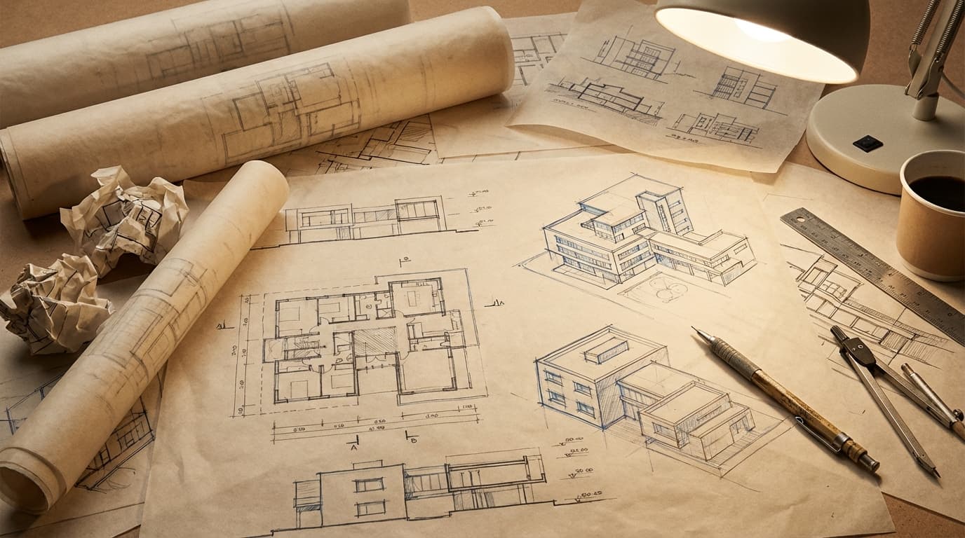
Keep the technical detail for Act 3, and even then, only what the client needs to make a decision. Floor plans are not a presentation tool — they are a working document. Use them to answer questions, not to open with. Architecture client presentations should contain no more than 12 to 15 slides for a standard design review. More than this shifts the format from conversation to report, and clients disengage. I've seen 60-slide decks. The person presenting them thought they were being thorough. The client thought they were being buried.
Practical exercise: take your last presentation deck and reorder it into the three-act structure. Notice what you cut.
Show the Right Things in the Right Order
Not all visuals are equal. A photorealistic render of a kitchen tells a client what it will look like. A hand sketch of the same space tells them you understand how they'll use it. Both have a role — but at different moments in the presentation, and getting the sequence wrong is one of the most common and most damaging mistakes in an architecture client presentation.
Visuals That Do Work vs Visuals That Just Look Good
In an architecture client presentation, photorealistic renders should be introduced after the design concept has been established — leading with renders causes clients to focus on surface details before buying into the overall vision. On a commercial project I once opened with a polished exterior render. The client spent the first twenty minutes fixated on the cladding colour, which wasn't even specified yet. We'd lost the room before the concept had been explained.
The most effective visual sequence for architecture client presentations moves from mood and atmosphere, through spatial concept diagrams, into rendered proposals, and closes with an immersive walkthrough or animation.
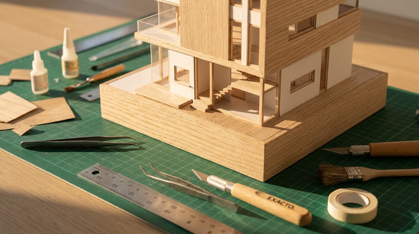
Physical models still matter enormously for residential and conservation work. A client who can hold a model understands scale in a way no screen can replicate. There is something about the tactile reality of a physical object that digital tools haven't replaced, and probably won't.
Enscape and Lumion walkthroughs are powerful for immersive experience — but use them to close, not to open. They are the emotional punctuation at the end of a well-structured argument, not the argument itself. If you want to understand how to use real-time rendering as a communication tool rather than just a technical output, ArchAdemia's Enscape Complete Guide covers exactly this — how to build walkthroughs that serve the presentation rather than overwhelm it, as part of its 60+ course library for over 4,000 members globally.
Renders, Models, and When to Use What
| Visual Type |
Best Used At |
Client Impact |
Risk If Used Wrong |
| Visual TypeMood / precedent imagery |
Best Used AtOpening |
Client ImpactEmotional buy-in |
Risk If Used WrongSets wrong expectations |
| Visual TypeConcept diagrams |
Best Used AtEarly–mid |
Client ImpactCommunicates design logic |
Risk If Used WrongToo abstract for non-architects |
| Visual TypePhysical model |
Best Used AtMid-presentation |
Client ImpactTactile scale understanding |
Risk If Used WrongCan distract into detail too early |
| Visual TypePhotorealistic render |
Best Used AtMid–late |
Client ImpactConfidence in outcome |
Risk If Used WrongLocks client onto surface details before concept is sold |
| Visual TypeWalkthrough / animation |
Best Used AtClosing |
Client ImpactEmotional resonance, memorability |
Risk If Used WrongOverwhelms if concept not already understood |
| Visual TypeFloor plans |
Best Used AtQ&A / handout |
Client ImpactTechnical reference |
Risk If Used WrongDerails narrative if used as primary presentation tool |
Talk Less Than You Think You Should
Most architects over-present. They fill every silence with explanation. It is a defence mechanism dressed up as communication, and it does the opposite of what they intend.
The Silence Problem
Architects who over-explain during client presentations undermine confidence in their own work. The most effective technique is to present a decision, state why it serves the client's brief, then stop talking. That's it. Say what it is. Say why it matters to them. Stop. If they want more, they'll ask. If they don't ask, they either understood or they've moved on — and either way, keep talking and you've lost them.
Silence after a key reveal is not awkward. It is the client processing. Let them process. The instinct to fill that silence with justification signals insecurity and undermines the work more than any design decision ever could.
How to Handle Questions Without Unravelling
When a client raises an objection during an architecture presentation, the correct response is to repeat the concern back to confirm understanding before responding — not to immediately offer design changes. This is not a stalling tactic. It is how you avoid answering the wrong question with the right answer.
When a client says "I'm not sure about this," that is not a rejection. It is an invitation. An invitation to ask what they were expecting, what they were hoping for, what the gap is between what they're seeing and what they imagined. Do not immediately offer to change it. Ask first. The answer will tell you whether you need to change the design or just the explanation.
Practical exercise: in your next presentation, set a personal rule — no more than two sentences before pausing to check in with the client. It will feel deeply unnatural. Do it anyway.
The Room Matters More Than the Slides
Where you present changes how the work is received. This is not a minor variable. A presentation in your studio, where you control the screen size, the lighting, the physical model on the table, and the material samples arranged just so, is a fundamentally different experience from presenting on a laptop balanced on the corner of a client's boardroom table.
Physical vs Digital Presentations
Architecture client presentations are more effective when supported by physical material samples and printed leave-behinds — clients retain significantly more from tangible materials than from digital slides alone. Print a leave-behind. Not the full deck — a curated A3 or A2 summary of the key moves. Clients forget roughly 80% of what they saw on screen. The thing they take away is the thing they remember when they're talking to their partner that evening, or their board the following morning.
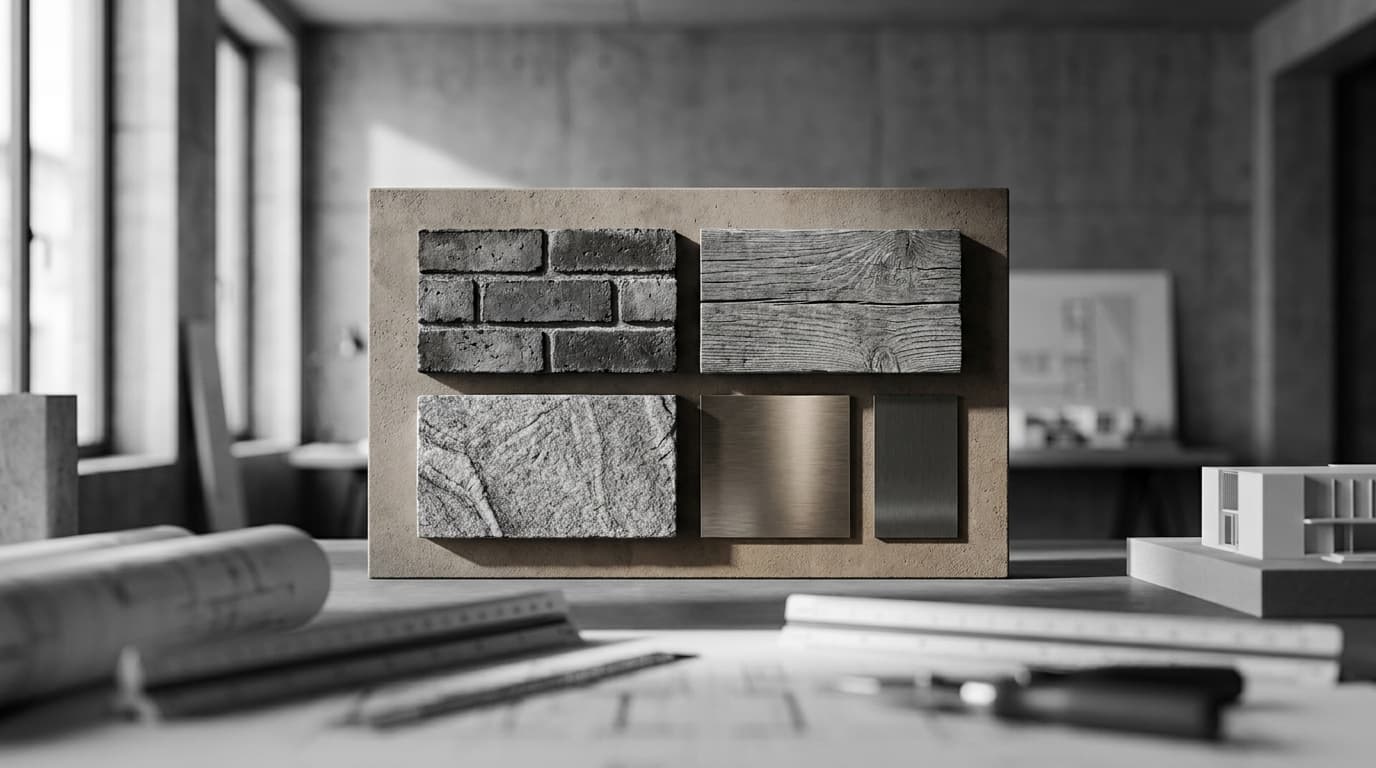
Material samples in the room are not just about specification. A piece of brick, a tile, a timber sample on the table signals that this is not a theoretical exercise. It makes the project feel real before it is real. That matters more than most architects give it credit for.
Setting the Room to Work for You
If you can, present on your territory or a neutral space. If you must present in theirs, arrive early and reconfigure what you can. Move the chairs. Find the screen. Work out where the light falls. These are small things that add up.
For remote presentations — which are now standard for many practices — the rules change. Keep decks shorter than in-person equivalents. More check-ins. Share your screen but keep your face visible. Follow up within 24 hours with a written summary, because remote clients disengage faster and retain less. For remote architecture client presentations, keep decks shorter than in-person equivalents, maintain face-to-face video contact while screen-sharing, and follow up within 24 hours with a written summary of key decisions.
ArchAdemia's Drawing Board portfolio platform is built for exactly this kind of curated, shareable presentation — members can build project pages that function as living leave-behinds, accessible after the meeting ends, which means the work keeps presenting itself long after you've left the room.
Close the Room, Not Just the Presentation
Most presentations end with "so, any questions?" This is the weakest possible close. It hands control back to the client at the exact moment you should be holding it.
What a Good Ending Looks Like
A strong close does three things. It summarises the single most important decision the client needs to make — not everything, just the one thing. It tells them what happens next, specifically and with a timeline. And it makes them feel that the project is already moving.
The walkthrough or the final render isn't the close. It's the emotional setup for the close. After the image lands, after the silence, that's when you say: "What we'd like to do is take your feedback from today and come back to you within two weeks with a refined proposal and a preliminary cost plan. Does that work?" Specific. Actionable. Forward-moving.
The Next Step Is Not Optional
Don't leave a client presentation without a defined next step that both parties have agreed to out loud. Not "we'll be in touch." Not "let us know what you think." A specific action, a specific person responsible, and a specific date. The project exists in the gap between your last meeting and your next one — and if that gap is undefined, the project stalls.
The architectural presentation course on ArchAdemia — available here — goes into this in detail, covering how to structure the close, how to handle the follow-up, and how to keep momentum between meetings. Because the presentation doesn't end when you close the laptop.
You're Always the Translator
Every technique in this article comes back to the same principle. Know who you're translating for. Structure the translation so they can follow it. Show them the images that make it real at the right moment. Stop talking when the message has landed. Set up the room so the work speaks before you do. Close with a next step, not a question.
The translation is the job. The architecture is what you're translating. Get that the wrong way round and you'll keep losing rooms that were yours to win.
If you want to build the skills that make this feel less like performance and more like second nature, the Perfect Presentation course is where ArchAdemia members start — because the best architecture client presentation isn't the most polished one. It's the one that makes the client feel understood.
FAQ: Architecture Client Presentations
What is the best structure for an architecture client presentation?
The best structure follows a three-act narrative: the problem (brief and site constraints), the insight (the design concept driver), and the resolution (the proposal and its outcomes). This sequence builds emotional investment before asking clients to evaluate rationally, which is the order in which human decision-making actually works.
How many slides should an architecture client presentation have?
Architecture client presentations should contain no more than 12 to 15 slides for a standard design review. More than this shifts the format from conversation to report, and clients disengage. If your deck is longer, you are writing documentation, not presenting.
When should you show photorealistic renders in a client presentation?
Photorealistic renders should be introduced after the design concept has been established — typically in the second half of the presentation. Leading with renders causes clients to fixate on surface details before buying into the overall vision, which derails the narrative before it has begun.
How do you handle a client who objects to the design during a presentation?
Repeat the concern back to the client to confirm you have understood it correctly before responding. This prevents you from answering the wrong question. When a client says "I'm not sure about this," ask what they were expecting rather than immediately offering to change the design — the answer will tell you whether the problem is the design or the explanation.
What is the most effective way to close an architecture client presentation?
Close by identifying the single most important decision the client needs to make, stating the specific next step with a timeline, and confirming agreement out loud before leaving the room. Never close with "any questions?" — it hands control back to the client at the moment you should be directing the conversation forward.
How do you present architecture projects remotely?
For remote architecture client presentations, use a shorter deck than you would in person, keep your face visible while screen-sharing, build in more frequent check-ins to maintain engagement, and follow up within 24 hours with a written summary of decisions made. Remote clients disengage faster and retain less than in-person audiences.
What physical materials should you bring to an architecture client presentation?
Bring material samples relevant to the key specification decisions, a physical model if the project scale allows it, and a printed A3 or A2 leave-behind summarising the key design moves. Clients retain significantly more from tangible materials than from digital slides alone, and the leave-behind continues presenting the project after the meeting ends.
How do you tailor an architecture presentation for different client types?
Residential clients prioritise liveability, build cost, and planning risk — lead with how the space will feel to live in. Commercial clients prioritise programme, cost per square metre, and board approval — lead with efficiency and risk mitigation. Heritage clients prioritise sensitivity to the existing fabric and conservation officer response — lead with precedent and rationale. The best architecture client presentations are tailored to the decision-maker's specific priorities, not the architect's interests.