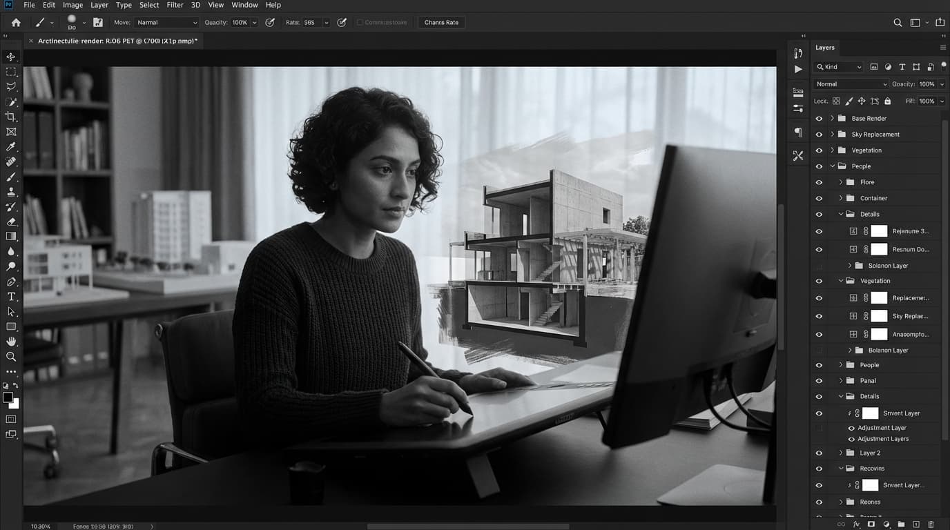
Raw renders almost never look good straight out of the engine. Not because V-Ray failed you, not because your model was wrong — but because post-production is where the image actually gets made. Photoshop architecture post production is the process of transforming raw renders or CAD exports into polished, presentation-ready visuals using colour correction, compositing, and atmospheric effects. Skip it, or do it badly, and even a technically excellent render looks like a student exercise.
The most common reason architecture renders look unconvincing is not the render engine — it is the absence of a structured post-production workflow in Photoshop. This guide gives you that workflow. Start to finish, non-destructive, repeatable. We'll cover file setup, layer structure, sky and ground work, entourage compositing, and colour grading — everything you need to take a flat render and turn it into something that wins competitions and fills portfolios.
The best file format for Photoshop architecture post production is 32-bit EXR, which preserves full HDR lighting data from render engines including V-Ray, Enscape, and Lumion. For architects exporting from V-Ray or Enscape, a 32-bit EXR file is the best starting point for Photoshop post production — it retains lighting data that JPEGs permanently discard. Once you export as JPEG, that information is gone. You cannot recover blown highlights or crushed shadows from a compressed file. Start with EXR, always.
File Formats and Render Passes
Here's the quick comparison you actually need:
Format
Bit Depth
Best Use Case
Limitations
FormatEXR (32-bit)
Bit DepthFull HDR
Best Use CaseRender work, compositing
LimitationsLarge file size
FormatTIFF
Bit Depth8 or 16-bit
Best Use CasePrint delivery
LimitationsNo HDR data
FormatPNG
Bit Depth8-bit
Best Use CaseWeb/screen output
LimitationsNo HDR, no passes
FormatJPEG
Bit Depth8-bit
Best Use CaseFinal compressed delivery
LimitationsLossy, no recovery
Render passes are where serious post-production begins. The beauty pass is your base — the complete rendered image. But the passes that give you control are: diffuse (surface colour without lighting), reflection (isolated reflective elements), shadow (cast shadows as a separate layer), and depth (distance from camera, essential for depth of field effects in post). Not all of these are non-negotiable for every job. For a quick client update, beauty plus depth will do. For competition work, pull everything.
Canvas size matters more than people admit. Architects should export a minimum canvas size of 3000 pixels on the long edge for print-quality post-production work in Photoshop. For screen-only presentations — client meetings, PDF portfolios — 1920 pixels on the long edge is sufficient. Going smaller than that and you'll see compositing artefacts the moment anyone zooms in.
Organising Your Asset Library Before You Start
Having a pre-organised entourage asset library — people, trees, vehicles, skies — reduces Photoshop post-production time by 30 to 40 minutes per image on average. That's not a trivial saving when you're working to a deadline at midnight. Organise by category, then by lighting condition: daytime people, overcast people, golden hour people. Same for skies. Same for trees. The five minutes you spend sorting this once saves hours across a project.
ArchAdemia's Toolkit is worth using for project organisation at this stage — keeping render versions, asset references, and delivery specs in one place prevents the chaos that hits when a client requests a revision two weeks after you've forgotten which file was which.
The Layer Stack That Does the Heavy Lifting
The correct Photoshop layer order for architecture post production places the base render at the bottom, followed by background, midground, and foreground entourage, with colour grading adjustment layers and atmospheric effects at the top. Never the reverse. If your colour grade is sitting below your entourage, you're fighting the composite on every single element you add.
The Non-Destructive Layer Order Every Architect Should Use
Non-destructive editing using adjustment layers and smart objects is the professional standard for architecture post production in Photoshop — direct edits to the render layer permanently destroy flexibility. This is not optional. The moment you paint directly onto your render layer, you've locked yourself into that decision. Client wants a warmer grade? You're starting over. Render gets updated? You're rebuilding from scratch.
Here's the layer stack from bottom to top:
Base render (smart object — always)
Render passes (reflection, shadow, depth — each in its own group)
Background (sky, distant landscape)
Midground (trees, vehicles, distant people)
Building (the render itself, possibly split by material zone)
Foreground (blurred vegetation, shadow overlays)
People (with individual adjustment layers clipped to each)
Atmospheric effects (haze, lens flare, vignette)
Colour grading (Curves, Hue/Saturation, Gradient Map — all adjustment layers)
Adjustment Layers vs Direct Edits — Why One Will Ruin Your Workflow
The adjustment layers doing the heavy lifting in a professional workflow are: Curves (contrast and channel-level colour shifts), Hue/Saturation (targeted desaturation of specific colour ranges), Color Balance (shadows/midtones/highlights independently), Selective Color (surgical control over specific hues — essential for concrete and timber), and Gradient Map (toning, more on this shortly).
Organising Photoshop layers into named groups by spatial zone — background, midground, foreground, sky, people, grading — is the most efficient structure for complex architecture composites. Name every layer before you start compositing. Yes, it sounds obvious. No, almost nobody does it. Three hours into a composite you will be deeply grateful to past-you for naming that layer "people_midground_woman_blue" instead of "Layer 47 copy 3."
ArchAdemia's Photoshop for Architects course covers this layer structure in full detail with downloadable project files — if you want to work through a real composite from scratch with video guidance, that's the place to go.
Sky, Ground, and the Bits Most Tutorials Skip
Sky replacement in Photoshop architecture post production is most accurately achieved using manual layer masking with luminosity selections — Photoshop's automated Sky Replacement tool frequently misreads glazed or reflective building edges. The automated tool is fine for landscape photography. For architecture, where you have sharp geometric edges, glass facades reflecting the old sky, and parapet lines that need pixel-perfect masking, it fails often enough that you cannot trust it on professional work.
Replacing Skies Without Destroying Your Building Edge
The reliable process: use Select Subject to get a rough selection of the building, then refine the edge manually using the Refine Edge brush on any complex geometry — tree canopies, railings, perforated screens. Invert the selection to get the sky area. Place your new sky on a layer directly below the building layer. Then — and this is the step most people skip — add a Curves adjustment layer clipped to the sky layer and match its colour temperature to the light hitting your building. A warm golden-hour sky sitting behind a building lit with cool daylight is immediately wrong, even if viewers can't articulate why.
For sky replacement in architecture renders, the best Photoshop technique in 2026 is manual masking with a Luminosity selection — it handles glass and reflective facades more accurately than automated tools.
Ground Plane Grounding: Reflections, Shadows, and Wet Surfaces
Adding a flipped, masked, low-opacity copy of a building render to simulate ground plane reflections takes under five minutes in Photoshop and significantly increases photorealistic credibility. Duplicate your building layer, flip it vertically, position it below the ground line, mask it to the ground plane, drop opacity to 15–25%, and set blend mode to Screen or Soft Light. That's it. Five minutes. The difference is substantial.
Wet ground: find a wet tarmac or wet stone texture, overlay it at 20–30% opacity in Multiply mode, then add specular highlights using a soft white brush on a Screen layer. Tap in the highlights where street lamps or windows would cast reflections. This reads as photographic immediately.
Foreground Depth — The Element That Separates Amateur from Professional
Foreground depth elements — blurred dark foliage or shadow overlays at the bottom of the frame — are the most commonly skipped technique in student architecture post production, and their absence is the clearest signal of an inexperienced compositor. Without foreground depth, the image looks like a floating diagram. With it, the viewer feels placed inside the scene.
The technique: find a tree or foliage PNG, place it at the bottom corners of the frame, apply a strong Gaussian blur (15–30px depending on resolution), reduce opacity, and clip a Curves layer to darken it further. The result is a natural vignette that frames the building and creates genuine spatial depth. Before this technique: a flat, airless render. After: a scene the viewer inhabits.
People, Trees, and Entourage Without the Uncanny Valley
The best free sources for architecture entourage cut-outs for Photoshop post production in 2026 are Skalgubbar for people and Unsplash for raw photography to manually cut — both are free for commercial use. Skalgubbar gives you pre-cut people with a distinctive illustrative quality that works particularly well for competition imagery. Unsplash gives you raw material to cut yourself, which gives more control over pose, scale, and lighting direction.
Sourcing and Scaling Entourage Correctly
In Photoshop architecture compositing, a standing person's eye level should align with the horizon line of the render — this is the most frequently violated scaling rule in student post-production work. If your render has a 1.5m eye-level camera, every standing adult in the scene should have their eyes at exactly that horizon. Not their head. Their eyes. Get this wrong and the whole scene reads as wrong, even to viewers who couldn't tell you why.
Scale trees by reference: if you know a ground floor is 3.5m, your tree should be proportionally correct against that datum. Use the building as your measuring stick, not your instinct.
Blending Cut-Outs So They Actually Belong in the Scene
The cut-out catalogue look — where every figure is perfectly lit from the front, full saturation, standing in isolation — kills composites immediately. Fix it with three steps.
First: desaturate entourage cut-outs by 10 to 15 percent before applying scene-level colour grading — raw photography is almost always too saturated relative to rendered architecture. Preventing the over-saturated look that immediately marks a composite as amateur starts here.
Second: clip a Curves adjustment layer to each figure and match their brightness and colour temperature to the light source in your render. A figure in afternoon shadow should not be lit like they're standing in direct sun.
Third: every person and tree needs a shadow. Use a dark, low-opacity ellipse on a Multiply layer beneath each figure, stretched in the direction of the light source. Without shadows, entourage floats. With them, it lands.
Vary scale, overlap elements, and apply motion blur to foreground figures. Never use the same tree asset twice at the same scale in the same image.
Colour Grading: Make a Deliberate Choice or Look Like Everyone Else
The three colour grading approaches for Photoshop architecture post production are warm-natural, cool-contemporary, and cinematic — each communicates a distinct design intent and should be chosen to complement the building's material palette. Colour grading is not decoration. It is narrative. The grade you choose tells the viewer what kind of building this is, who it's for, and how it feels to be near it.
The Three Grading Approaches and When to Use Each
Grade Style
Mood
Best For
Key Settings
Typical Building Types
Grade StyleWarm-Natural
MoodWelcoming, organic
Best ForResidential, timber, brick
Key SettingsWarm shadows, lifted midtones, golden highlights
Typical Building TypesHousing, schools, community buildings
Typical Building TypesOffices, cultural buildings, civic
Grade StyleCinematic
MoodDramatic, high-impact
Best ForCompetition entries, awards
Key SettingsHigh-contrast S-curve, crushed blacks, split tone
Typical Building TypesAny type — used for visual impact
For competition architecture imagery, a cinematic grade with a high-contrast S-curve and lightly crushed blacks is the dominant visual style used by shortlisted practices in major awards in 2026. If you're entering a competition and your render looks naturalistic and balanced, you're fighting against the visual register that judges are now conditioned to respond to. That's a choice — just make it consciously.
Curves, Selective Colour, and Gradient Map — The Essential Trio
Curves: apply an S-curve to the composite Curves adjustment layer for overall contrast. Then work individual channels — pull the red channel slightly warm in the midtones for a golden-hour feel, or push the blue channel up in the highlights for a cool contemporary look.
Selective Color: target specific colour ranges surgically. Neutralise the grey in concrete by reducing cyan and magenta in the Neutrals. Warm timber by adding red and yellow to the Yellows range. Cool the sky by adding cyan to Blues.
A Gradient Map adjustment layer set to 5 to 15 percent opacity, using a warm-shadow to cool-highlight gradient, is the most efficient single technique for achieving professional colour toning in Photoshop architecture post production. Set the blend mode to Soft Light, dial it back until it's subtle, and it unifies the entire composite with a cinematic quality that would take five separate adjustments to replicate any other way.
Photoshop vs Lightroom vs Affinity Photo: Pick the Right Tool
Photoshop is the best software for architecture post production compositing in 2026 because it is the only option that supports multi-layer compositing, render pass management, and advanced masking simultaneously. Lightroom and Affinity Photo are capable tools, but they serve different functions.
Feature
Photoshop (CC 2026)
Lightroom Classic
Affinity Photo 2
FeatureCompositing capability
Photoshop (CC 2026)Full
Lightroom ClassicNone
Affinity Photo 2Good
FeatureColour grading tools
Photoshop (CC 2026)Excellent
Lightroom ClassicExcellent
Affinity Photo 2Good
FeatureRender pass support
Photoshop (CC 2026)Yes (EXR)
Lightroom ClassicNo
Affinity Photo 2Partial
FeatureCost (2026)
Photoshop (CC 2026)£55/month (CC All Apps) or £26/month (Photography plan)
Lightroom ClassicIncluded in Photography plan
Affinity Photo 2£65 one-off
FeatureLayer-based editing
Photoshop (CC 2026)Yes
Lightroom ClassicNo
Affinity Photo 2Yes
FeatureBest use case
Photoshop (CC 2026)Full compositing workflow
Lightroom ClassicBatch photo correction
Affinity Photo 2Budget compositing
FeatureIdeal for
Photoshop (CC 2026)Archviz artists, competition work
Lightroom ClassicPhotography-heavy portfolios
Affinity Photo 2Students on tight budgets
Lightroom is not a compositing tool. It's a correction and batch-processing tool — excellent for adjusting site photography or preparing portfolio photographs, but it cannot handle entourage, layer stacks, or render passes. It has no place in a post-production compositing workflow.
Affinity Photo 2 is a legitimate alternative for students who cannot justify the Adobe subscription cost. At £65 as a one-off purchase, it handles EXR files, supports layer-based compositing, and has a capable set of adjustment tools. It lacks some of Photoshop's masking intelligence and has a smaller ecosystem of tutorials and resources. For professional practice, Photoshop remains the standard. For a Part 1 student doing their first competition entry on a tight budget, Affinity Photo 2 is a reasonable starting point.
The Workflow in Full: A Repeatable Sequence
This is the sequence. Follow it in order. Every time.
Export — 32-bit EXR from render engine, minimum 3000px long edge, with render passes where available
Open in Photoshop — place base render as smart object, set canvas to working resolution
Build the layer stack — name and group everything before compositing begins
Sky — replace using manual masking, match colour temperature to building lighting
Foreground depth — blurred foliage, shadow overlays, vignette elements
People — scaled correctly to horizon, desaturated, shadowed, colour-matched
Colour grade — Curves for contrast, Selective Color for material targeting, Gradient Map for toning
Final output — flatten to TIFF for print delivery, export to JPEG (quality 10+) for screen
The whole process, once you have the workflow embedded, runs in under two hours for a single exterior view. The first time takes longer. The tenth time is automatic.
Frequently Asked Questions
What is Photoshop architecture post production?
Photoshop architecture post production is the process of enhancing raw architecture renders using compositing, colour correction, and atmospheric effects in Adobe Photoshop. It transforms technically correct but visually flat render outputs into compelling, presentation-ready images suitable for client presentations, competition entries, and portfolio work.
What file format should architects use for Photoshop post production?
The best file format for Photoshop architecture post production is 32-bit EXR, which preserves full HDR lighting data from render engines including V-Ray, Enscape, and Lumion. JPEG and PNG discard this data permanently — once exported at 8-bit, highlights and shadow detail cannot be recovered.
How long does architecture post production in Photoshop take?
A single exterior architecture render typically takes 1.5 to 2 hours to post-produce in Photoshop using a structured workflow. Without a repeatable workflow, the same image can take 4 to 6 hours. Building a consistent layer template and a pre-organised asset library is the single biggest time-saving investment.
What is the best layer order for architecture compositing in Photoshop?
The correct layer order places the base render at the bottom, followed by background, midground, and foreground entourage layers, with colour grading adjustment layers and atmospheric effects at the top. Colour grading must sit above all composited elements to apply uniformly across the entire image.
Should I use Photoshop's Sky Replacement tool for architecture renders?
No. Photoshop's automated Sky Replacement tool frequently misreads glazed facades, reflective surfaces, and sharp geometric building edges. Manual masking using a luminosity selection and a hand-refined layer mask produces more accurate results, particularly on buildings with glass curtain walls or complex rooflines.
What are the best free entourage sources for Photoshop architecture post production?
The best free sources for architecture entourage cut-outs in 2026 are Skalgubbar (pre-cut people, free for commercial use) and Unsplash (raw photography for manual cutting, also free for commercial use). Both are widely used in professional practice. Always desaturate cut-outs by 10–15% before compositing to prevent the over-saturated look of raw photography against rendered architecture.
Is Affinity Photo a viable alternative to Photoshop for architecture post production?
Affinity Photo 2 is a viable alternative for students and early-career architects on a tight budget. At a one-off cost of £65, it supports EXR files and layer-based compositing. It lacks some of Photoshop's advanced masking tools and has a smaller tutorial ecosystem. For professional practice and competition work, Photoshop remains the industry standard.
What colour grading style is used by professional architecture practices for competition imagery?
The dominant colour grading approach for competition architecture imagery in 2026 is a cinematic grade — high-contrast S-curve, lightly crushed blacks, and a split tone between warm shadows and cool highlights. This approach is used consistently by shortlisted practices in major international architecture awards and has become the expected visual register for serious competition submissions.
Post-production is not the finishing touch. It is half the image. The render engine gives you the raw material; Photoshop is where you make the argument. Get the workflow right, and every render you produce from here becomes a portfolio piece. Get it wrong, and even technically excellent renders will keep looking like they're almost there.
If you want to work through this process with video instruction and real project files, ArchAdemia's Photoshop for Architects course covers the full compositing workflow — from EXR import to final export — with the kind of detail that a written guide can point to but not replace. Over 4,000 architects and designers are already using ArchAdemia's courses to close the gap between what they can model and what they can present. The workflow is learnable. Start learning it properly.