The Twinmotion tutorial sitting at the top of your search results was filmed against an interface that no longer exists. Panels have been merged, the library moved into the dock, the renderer picked up a path tracer, and the import dialogue was rewritten. Chasing a button that got relocated two versions ago is how people lose an evening before they've imported anything.
What hasn't changed is the order you do things in, and the order is most of the skill. Import and prove the scale. Fix three things about your materials. Set the sun. Scatter less than you want to. Export one still and one short walkthrough. Everything else is garnish, and garnish applied to a broken scene still tastes broken.
Stop looking for named menus. The current interface is two things: a dock along the bottom edge, and a scene list down one side.
The dock holds everything you add or change — import, the asset library (objects, vegetation, materials, characters, lights, the populate tools), the settings for sun and sky and weather, the media panel where cameras and videos live, and export. The scene list holds everything that already exists: your imported geometry as it came from the host model, plus every light, asset and camera you add afterwards.
If a tutorial tells you to click something you cannot find, type its name into the library's search bar. In practice that solves ninety percent of the "my version looks different" problem in about four seconds, and it's quicker than working out which release the video was recorded on.
One thing worth settling before you start: this is a GPU tool, and the viewport quality slider exists for a reason. If your laptop is grinding, drop the viewport quality while you work and raise it only when you judge the final frame. Epic publish system requirements for the current release — read them rather than guessing, because a machine that can't hold a steady viewport will make you blame your materials for what is actually a hardware problem.
Prove the Scale With a Person, Not a Number
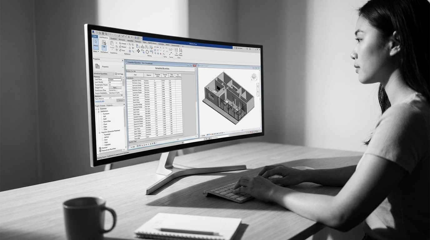
Import by whichever route your host model gives you — a live link from Revit, Archicad or SketchUp if the plugin is installed, or a file import if not. Either way, the first thing on screen is not a render. It's a measurement problem waiting to be found at the worst possible moment.
Drag a character out of the library and stand them in a door opening. A door head sits around 2.1m. If your character's eyes are level with the handle, or they're the size of a bollard, the import came in on the wrong unit. Go back to the host file, fix the export units and bring it in again. Do not scale it inside Twinmotion — scaled geometry fights every library asset you drop next to it, and texture sizes come along for the ride.
Two other things to check in the first two minutes. If the model sits a long way from the origin in the host file — common with geolocated Revit models and with anything dragged out of 3D Warehouse — move it near zero before you export. Far-from-origin geometry gives you shimmering shadows and wobbly edges, and you'll spend an hour blaming the renderer. And look at the inside faces. Materials often arrive correctly on one side of a surface and not the other, so check the underside of a soffit or the back of a wall now rather than after you've lit the scene.
Three Fixes That Stop It Looking Like Plastic
The default-import look is real and it has three causes. Fix these, in this order, on the five or six surfaces that occupy most of the frame. Ignore anything the camera cannot see.
Texture size. A brick material at the library default tiles like upholstery fabric. Every material has a size control; set it against something you know. A brick is 215mm long. A paving slab is 600mm. A plasterboard sheet is 1200 by 2400. Put the camera at the wall, drag the size until the pattern matches reality, move on. This single adjustment does more for believability than any post-process effect in the programme.
Uniform reflection. The giveaway on an untouched import is that every surface reflects identically — concrete, timber and plaster all behaving like the same slightly shiny vinyl. Pull the roughness apart. Off-form concrete is almost matt but never perfectly matt. A polished floor has a sheen that varies across its length. Glass needs real reflection or it reads as a grey hole. If a surface looks like a shop-bought render, the problem is usually that it's too clean and too even.
No wear. Nothing outdoors is new. A concrete stair with a little staining at the nosings, a wall with a darker band where rain runs off, a path with dirt at the edges — in our course we add exactly that kind of staining to Koshino House and it's the difference between a model and a photograph. Twinmotion's material library includes aged and weathered variants; use them on the horizontal surfaces first, because that's where dirt actually collects.
Sun First, Filters Last
Open the settings for the environment and do three things before you touch a single post-process slider: set the location, set the date and time, and rotate the sun.
Midday sun with the light coming straight down is the fastest way to flatten a building. You want the sun low enough that the shadows do the modelling for you — raking across the concrete, catching the edge of an opening. Spin the sun around the building and watch which side comes alive. That's your shot. We've covered why overhead sun and a painted-on sky kill an image in Why Your Enscape Renders Look Flat — the physics is identical in Twinmotion.
Then the sky. Cloud cover is not decoration; it controls how soft your shadows are. A clear sky gives you crisp architectural shadows and a hard contrast you'll have to manage. Light cloud softens everything. Pick one deliberately.
Only now do exposure and the post-process stack — vignette, bloom, white balance, depth of field. A filter applied to badly lit geometry just makes badly lit geometry shinier.
Interiors need one extra step. Switch the renderer to Lumen and look into a room: if it has a murky, underwater quality with crawling noise in the corners, that is not a settings fault. Not enough light is getting into the space for the renderer to work with. The fix we teach is the one an architectural photographer would use — put an area light outside the window, rotate it to face in, stretch it to the shape of the opening and dial the intensity down until it reads as daylight rather than a spotlight. Duplicate it to the other windows. The noise collapses and you get secondary highlights on the furniture that the sun alone never delivers.
Scatter Less Than You Want To
The populate tools are the most fun and the most dangerous part of the programme. You can paint vegetation, scatter it over a surface, or set a path and have characters and vehicles loop along it.
Three settings matter the moment you start painting. The default density is almost always wrong, so push it and judge by eye. Increase the age of the plants — young library vegetation looks like a garden centre, mature planting looks like a site. And turn the wind off. Wind blurs your foliage in a still, and in a path-traced frame it fights the sampler for no benefit.
The restraint part: scatter only what the camera sees, and leave gaps. A solid wall of trees across the back of a shot reads as a green curtain. Break it so you can see something through it — a fragment of a neighbouring roof, a sliver of sky — and the depth arrives instantly. Keep your scene list tidy as you go, with folders for vegetation and assets, because by the time you've scattered a site you'll have hundreds of entries and no idea which one is the bamboo.
The Still: One Camera, Then Patience
Create an image in the media panel from the view you've been working. Set it to 16:9 — a widescreen frame is what clients and portfolios expect, and it stops you cropping later.
For a final still, switch to the path tracer. The settings look intimidating and mostly aren't. Leave the firefly controls alone. Keep the denoiser on. Max bounces around ten, so light travels properly through the interior. The only dial that genuinely changes your output is samples per pixel, and here's the thing we found making the course: the built-in high preset is not enough for a final architectural still. Push the samples manually, well past the preset, and let it run.
The reason is the denoiser. At low sample counts it's doing heavy lifting and it eats fine detail — dappled tree shadow turns into blotchy soup. Raise the samples and the denoiser has less work to do, so it stops smearing the thing you spent the afternoon scattering. This render takes real minutes, not seconds. Start it and go and do something else.
The Walkthrough: Walk, Don't Fly
Create a video in the media panel and place keyframes along a route. Twenty to thirty seconds is plenty for a first one, and it's long enough to show a sequence of spaces without becoming a drone showreel.
Keep the camera at eye height, around 1.6m, and move it the way a person moves — forward through an opening, a slow turn into a courtyard, a pause. No orbiting. No swooping down from the sky. The moment the camera leaves human height the clip stops being architecture and starts being an estate agent's advert.
Render a low-quality pass first purely to check the timing. You will find the camera is moving too fast, because everyone's first attempt moves too fast. Fix it, then render properly. For video, Lumen is the sensible choice unless you have a machine and an evening to spare — path tracing an animation multiplies your still render time by every frame, and motion hides noise far better than it hides a missed deadline.
Then Do It Again Tomorrow
One still and one walkthrough out of a single sitting is a complete deliverable, and it's the only honest measure that you can use the software. Interface tours are not.
The second time through is where it actually sticks. Same model, different time of day, different camera — and it'll take you a quarter as long, because you'll stop hunting for panels and start making decisions about light.